Exhibitions of photography generally don’t come to the south west and so I need to travel to catch big well known exhibitions, something that has not been possible in the past. Back in February I went to The Radical Eye at Tate Modern in London as well as the Wolfgang Tillmans exhibition at the same place. I was finishing off my work for Context and Narrative, and it was a welcome change from seeing images in books or on television. Radical Eye had been open for some time and it was fairly quiet so there was plenty of time and space to consider the exhibits there. Dorothea Lange was on show and having spent some time studying her in previous modules, it was interesting to see the photograph up close. I also liked the portraits by Irving Penn and Edward Steichen, and the work of Imogen Cunningham (1883-1976) and Margaret Bourke-White (1904-1971). All in black and white, there was pathos and beauty in the work that stood out. Overall though, I felt that I couldn’t really connect with the way that it was presented, low tones and subdued lighting were overwhelming but I understand the reason for the lights in order to preserve the prints.
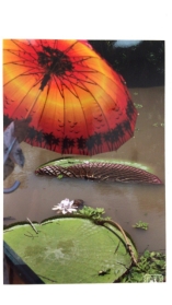
The Wolfgang Tillmans exhibition was completely different in terms of light, space, framing, hanging and approach. The first time that I saw it was a few days after it had opened and it was busy with lots of people of all ages packing the rooms. In contrast to the hushed reverence of The Radical Eye, there was a lot of chatter and conversation as people looked at the exhibits and discussed what they were seeing. I enjoyed wandering around and looking at the images, from huge prints hanging from bulldog clips to tiny prints apparently blu-tacked onto the wall. Photography was allowed in these rooms and I snapped some of the ones that appealed to me most with my phone camera, more of an aid to memory than to put on a wall or in an album. The one below caught my eye because of the striking colours of the orange umbrella against the muddy brown water and bright green lily leaves. This image was, I would think, a 6×4 print as it was tiny on the huge wall and dwarfed by other images with there was a lot of space around it.
I was interested by the tables of information in the middle rooms with the juxtaposition of printed sheets, sheets torn out of newspapers or printed out, and the almost confusing linkage of the items together. The ‘fake news’ stuff was really interesting and Tillmans commenting on the human psyche through this made me think more about the theme.
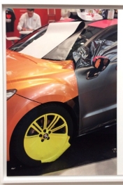
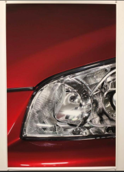
I revisited again last week, just before it closed, and had another look at the work this time without the crowds and noise. It changed the feel of the exhibition for me as though somehow it is meant to be viewed surrounded by lots of people in order to make it more relevant. This time, I also read the accompanying booklet which is something I often don’t do as I prefer to look first and think about it afterwards, or get an explanation for something in particular. I was interested in seeing whether the same images stood out for me as last time, given that I had more time and space to see them and I think that I consciously looked for a couple. The image of the car below, Fespa Car (2012) was one of the large prints, and I was drawn to it because of the colours – red, yellow, orange – as well as the black of the plastic. There is movement in the background of it and gives more of a sense of where the car is (at an exhibition, in a showroom?). This time, I was more drawn to the Headlight (2012) but I believe it’s probably because it was referred to in the booklet. The up close and personal view of the light was predatory, like a large eye watching you, especially with the red paintwork like a warning.
However, I still liked the very large prints of abstract things – the dirt from the printer rollers on exposed paper, the folds of paper, and the sky images at the very end of the exhibition. The printer ones tied in with the images of his office, and printer in pieces and touches on the production of photographs in that they go from something he sees to something printed on paper, but it can be changed by dirty rollers, incorrect settings and so on.
“What exactly are photographs? That’s a question that preoccupies David Hockney and there are signs that it intrigues Tillmans too. The darkroom equipment and materials can be used to do almost anything.”(https://www.spectator.co.uk/2017/03/coolly-contemporary-especially-in-its-muddle-wolfgang-tillmans-at-the-tate-reviewed/) This rings true because I went to the Hockney exhibition in April and was intrigued by his paintings and especially the montages of multiple images of the same thing to make up a whole that can be seen when you stand further away. Usually I want to get closer to see parts of the whole but in this instance I stood back to get the overall picture before getting really close and seeing what he had captured in each individual one.
So that’s my take on two exhibitions. I have been fortunate enough to see the David Hockney exhibition at the Tate Britain, Giacometti at Tate Modern, Wolfgang Tillmans twice at Tate Modern, The Radical Eye at Tate Modern and the Pink Floyd “Their Mortal Remains” at the Victoria and Albert Museum. Quite different but all interesting in their own rights.
